5 Ways to Increase Online Sales for the Holidays
Run a health check on your website and learn what's needed to prepare for and promote holiday e-commerce sales.
October 29th, 2019 • Custom Software Development Resources: Articles
Deloitte Insights recently released the findings from their 34th annual holiday retail survey. We dove into the full survey and brought back 5 actionable tips for you to make more money and better serve your customers this holiday season.
- Do a health check on mobile
- Highlight the customer experience
- Offer irresistible promotions
- Build your mailing list (securely)
- Start now!
Do a Health Check on Mobile
“Buying via smartphone continues to climb every year; 70% of smartphone users say they expect to make a purchase from their device, up from 41% five years ago.”
Our website design process factors in mobile responsiveness from start to finish. We design for several common screen sizes, showing how the content on the page will be displayed and how different pieces of information will be prioritized as the screen size changes.
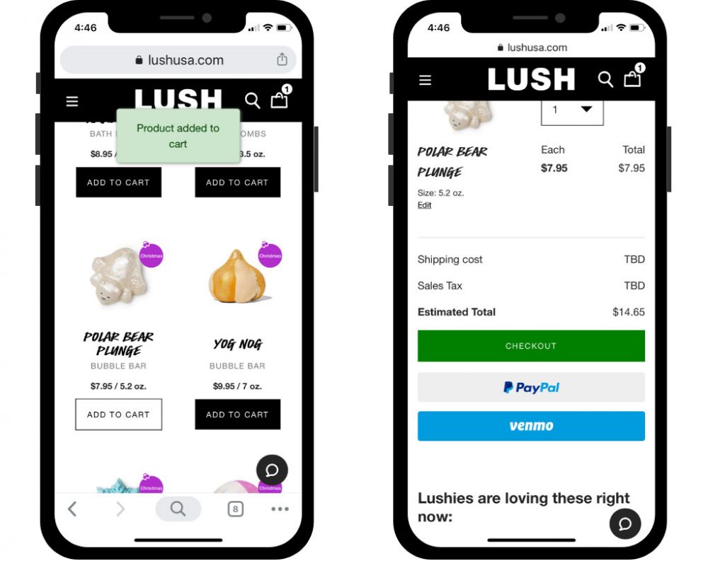
Take a look at your website on your phone. Recruit your friends and family to look on their screens, too. If you have an ecommerce website, ask your new helpers to test its function by attempting a task like finding a certain product and then placing it in the cart. Was it easy to find the item and proceed to the checkout phase? Did anything not meet your expectations?
If you end up with a list of improvements, we’re ready to help you! Connect with business development →

Highlight the Customer Experience
“The bulk ($596) [of shoppers’ total spend per household ($1,496)] will go to spending on experiences and celebrations—including entertaining at home and socializing away from home (including travel and restaurants).”
This is certainly the Digital Age, but we have also seen the rise of the Experience Economy. Just the other day, a friend of mine told me how she has begun to gift experiences—like cooking classes or museum trips—rather than traditional gifts, so she can bond with friends and family and treasure the memories made for a lifetime.
How can you make it an experience for your customers to visit you in-person rather than online? As a designer, I am constantly gathering inspiration from everything around me. Think of stores you have visited that have given special touches to your shopping experience. Was it the staff? Was it the store décor? What about the selection of products? Being that kind of memorable is your goal this holiday season!
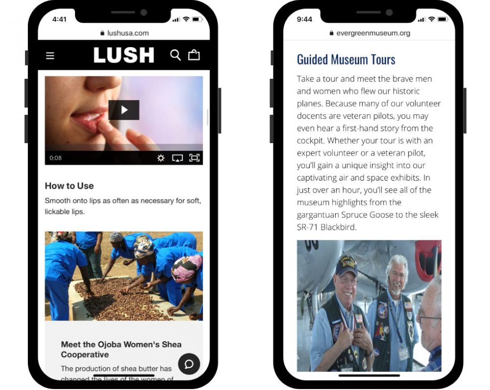
You might consider creating an “Experience” page on your website, dedicated to describing what it is like to interact with your product, service, and other business offerings.

Offer Irresistible Promotions
“Most consumers (81%) expect that promotions will influence them this holiday season—with price discounts (74%) and free shipping (72%) at the top of their wish list, far ahead of other incentives like BOGO (39%) and cash back (29%).”
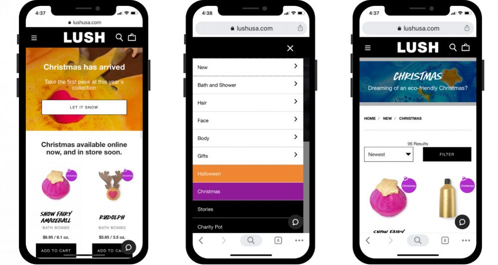
50% OFF! Buy One, Get One Free! Promotional discounts snag attention. Bonus points if they’re presented with an eye-catching design.
Think of bees and flowers. Different species of flowers look the way they do so they can be more appealing to the bees than their flower neighbors. You want your business to be the flower with the most attractive shape and color to your customers so they will go to you, not your competitors.
The combination of price discounts, free shipping, and distinctive design will make your business irresistible to holiday shoppers.
You should also think about how you can show them a good deal in exchange for sharing their contact information with you, which leads to our next tip.
Build Your Mailing List (Securely)
“Promotions, discounts, and other offers are the No. 1 thing people want from retailers in return for sharing their personal information, among 61% of respondents”
How do you maintain relationships with your customers after they’ve made their purchase? Are you giving them the chance to sign up for your promotional mailing list or company newsletter?
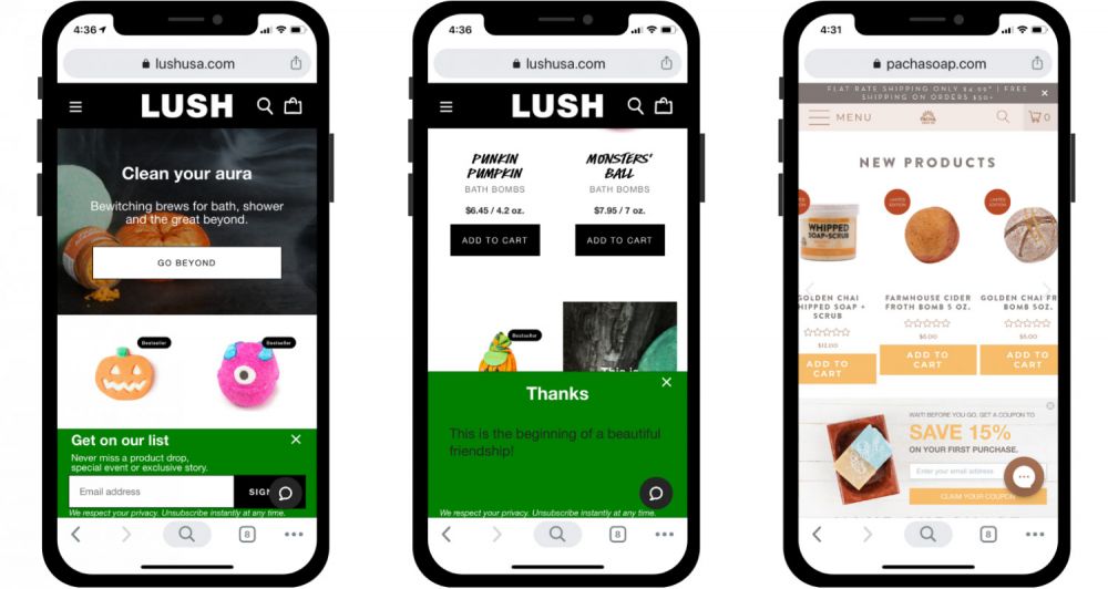
Build trust with your customers. Don’t use dark patterns on your website, like making them feel bad for declining to sign up for email updates or failing to explain how you are using their personal information.
Make it easy for them to understand how their information is being used. Something short and sweet will do: “Hey there, thank you for your interest! We will keep your information safe and secure, and we will never share it with others. We will be sending you one email per month with interesting articles and discounts, just for you.” Place a message like this next to your signup form to show you respect your customer and their privacy.

Whether your customers are visiting your website or your physical location, you can collect a contact list with a free service like MailChimp (or, if you’re a LVSYS CMS customer, we have a built-in Contacts module). Just let us know if you’d like some help getting this set up for your business! We’re happy to help →
“When you all came in, I wanted to take the website to the 21st century. We had a really archaic, old, clunky website that was not user-friendly, and you had to have coding experience to update. My goal was to find something that I could make on-the-fly updates to. I wanted a good, solid template that would be user-friendly going forward for both the end-user as well as myself. The forms we sat down and created were outstanding, easy, and they still hold true today.” – Mary Lynne DeRocher, Kairos
Start Now!
“Shopper traffic is expected to peak in early December, but it’s the early birds who plan to spend the most; those who begin shopping before Thanksgiving are expected to spend almost $400 more than those who start late.”
If you want to get ahead of early-bird shoppers, you’re going to have to start now!
As we transition from the mindset of spooky October to grateful November, folks are already thinking about how they can delight their friends and family this holiday season.

Tap us on the shoulder if you would like some help creating an action plan for the holidays. We look forward to hearing from you! Call us at 503-468-4880 today.
Siège de McMinnville
Sur rendez-vous uniquement
620 NE 3rd Street, Suite A
McMinnville, OR 97128
Rencontre en France
Sur rendez-vous uniquement
Nous appeler au 09-73-05-23-74
pour arranger un rendez-vous sur Paris ou en Province
Téléphone : 09-73-05-23-74
E-mail: contact@buildableworks.fr
En quoi pouvons-nous vous aider ?
Parlez de votre projet à un expert de chez Buildable.
Ce site est protégé par reCAPTCHA. Les Politique de confidentialité et Conditions de service de Google s'appliquent.
Copyright © 2025 Buildable.
Tous droits réservés
Politique de confidentialité | Conditions de service


